Working on LifeFlow's Public Face
The current work on LifeFlow has been focused on improving the usability of the blog for visitors. The 0.90 release was mostly focused on making the blog more usable for writers, so its been refreshing to get to work on a more visible aspect again.
The first thing I started working on was making LifeFlow generate compliant markup. Until recently I had been aiming for HTML4.01 Strict, but I decided to make the jump to xhtml, and getting it validated only took half an hour or so of chasing through the various templates trying to find unescaped line breaks and horizontal rules.

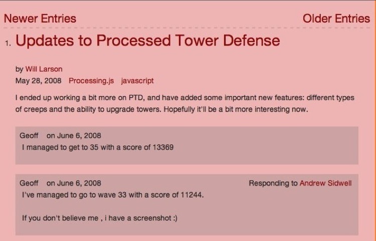
Something I have been wanting to do for a while was to in-line the comments into the lists displaying articles. The old (rather ugly) frontpage was a first step towards that, but it was the most timid and faltering of steps. This time I kind of like the result. Now when you page through entries you can see the three most recent comments right there in the list view.

I think this looks better, but also makes the content more accessible to readers as well. In addition, I made the pagination buttons more obvious, and added pagination support for the frontpage as well (it pages through all entries, whereas the flow pages only page through their contained entries).
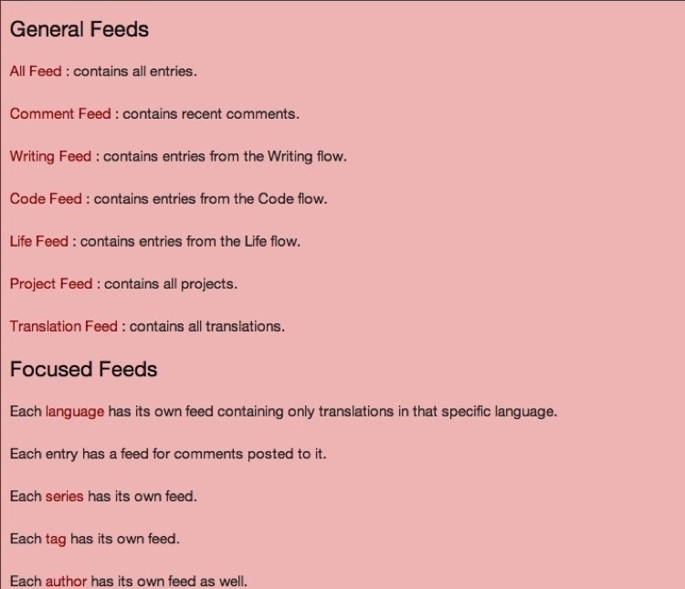
Next, I was kind of unhappy with the RSS page, which conveyed the necessary information, but looked like the carnage of a war between an XML document and a platoon of break lines.

Now that same information has been compacted into a much smaller, and easier to scan two paragraphs.

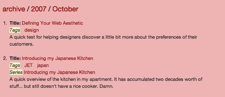
I've also been trying to improve the archive, which historically has kind of a tacked-on feed to it. First, I have added breadcrumbs to the top to make navigating around the archive a bit more convenient. Second, I've added a lot more information to the archive list view, which should make it easier to find interesting content, and also easier to find a specific article that someone might be looking for.

Beyond these changes, I have cleaned up templates, and in particular cleaned up the shortsighted template/url/view trifecta that used to control article editing in the LifeFlow Editor. As anyone looking at my recent posts can tell pretty easily I am in a bit of a LifeFlow development kick, so there will be a bit of a development sprint for the upcoming week or so before things cool down for a while again as I shift focus to other projects.
I'd be very curious to hear any feedback about things that seem to be working well in the LifeFlow design, or things that really ought to be improved upon because they make the blog less usable. Oh, on that note, one last change: comments are now displayed in coherent order (comments in the same sane threaded ordering we expect from a threaded comment system) instead of mixed threaded first-last-crazy-insane order that they previously were displayed in. I got tired of thinking of it as a feature, and decided to acknowledge to myself that it was a bug, and a bug that needed to be fixed... so that is fixed as well.
Take care, and looking forward to any feedback!
Last thought. I pushed my changes out to the VPS hosting lethain.com, and also updated the VPS's Django source to head. There were a few odd errors to iron out, but things are working correctly with head.