Smaller Header, JobSyndicate, Printable Articles
I did some tweaks to the site this morning, trying to make the site a bit more usable and improve the appearance ever-so-slightly.
The first comment my friend Luke made about the site was that it had a huge header, which pushed content below the fold. I wasn't particularly concerned with that, but my goal has always been for Irrational Exuberance to be exclusively about the content, and I think reducing the size of the header helps the content play an increasingly central role in interacting with the site.
Actually, even though the header was huge, it was actually very small in terms of available space to display information, so moving the links down to the footer has allowed me to display articles from all tags and series and still display random and recent entries as well.

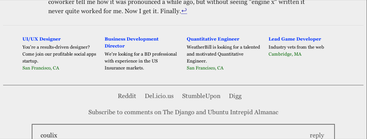
A few weeks (months? I can't keep track of these things, I think their community outreach guy may hate me for signing up and then disappearing...) ago I was accepted to the JobSyndicate beta to publish their job adverts on this site.
I'm not at all concerned about this site directly supporting itself with revenue, but I am interested in the experimenting in non-detrimental ways with revenue. JobSyndicate is offering jobs relevent to my readerbase, so I'm giving it a trial. If readers dislike them, I'll probably remove them. Honestly though, I find them pretty unobjectionable. Whether or not they'll have any impact is another story.
I'm using my django-monetize project to target these ads for entries in the Code flow. No point in displaying them in my small and uninteresting ramblings in Life, and even less of a point of displaying them on navigational pages (archive, tag cloud) or information pages (about, projects).

I realize very few people care, but I really find django-monetize
to be exactly the tool I wanted when I started working on it.
It took about five minutes to integrate the JobSyndicate into my
targetting scheme, allows me to pick precisely which ad slots
(I'm still leaving the header slot empty, seems a bit too
abrasive), and also allows me to use a fallthrough method for
selecting advertisement.
For example, right now I display PayPal donation requests for
the Epic Introduction to PyObjC
series. If an entry is in the Code flow but not in
that series, then it will display the JobSyndicate ads. If it
is neither in that series nor in Code, then it falls through
once again (to nothing ;).
This level of granularity really appeals to me, because it lets me ask for support for specific things (a long tutorial series) instead of asking support for me. It also lets me perform relatively non-intrusive modifications and experiments.
The final recent change is that the CSS for printing articles is much saner, so it should now be possible to print articles and read them at your leisure, rather than only viewing them online.
Let me know what you think of the changes, along with any suggestions for improvements.
As the day progresses, some other changes:
- Oh. I also changed the archive a bit to make it easier to scan.
- The tag cloud is now in human order instead of weird capitals alphabetical, lowers alphabetical.
- List of articles for each tag use the same brief format as archive.
- Five articles on the frontpage instead of 3. Seems better that way.
The next day...
I've moved lethain.com (and all my other domains as well) over to my mod_wsgi slice, and setup far-future expires and compression for the CSS and JS files, so hopefully there will be bountiful speed improvements. I am definitely glad to be done with my old box, whose setup was getting increasingly fubared.