Public company comparables.
A few years ago I wrote about reading a Profit & Loss statement, which is a foundational executive skill. I also subsequently wrote about ways to measure your engineering organization. Despite having written those, I still spend a lot of time wondering about effective ways to represent an engineering organization to your board of directors.
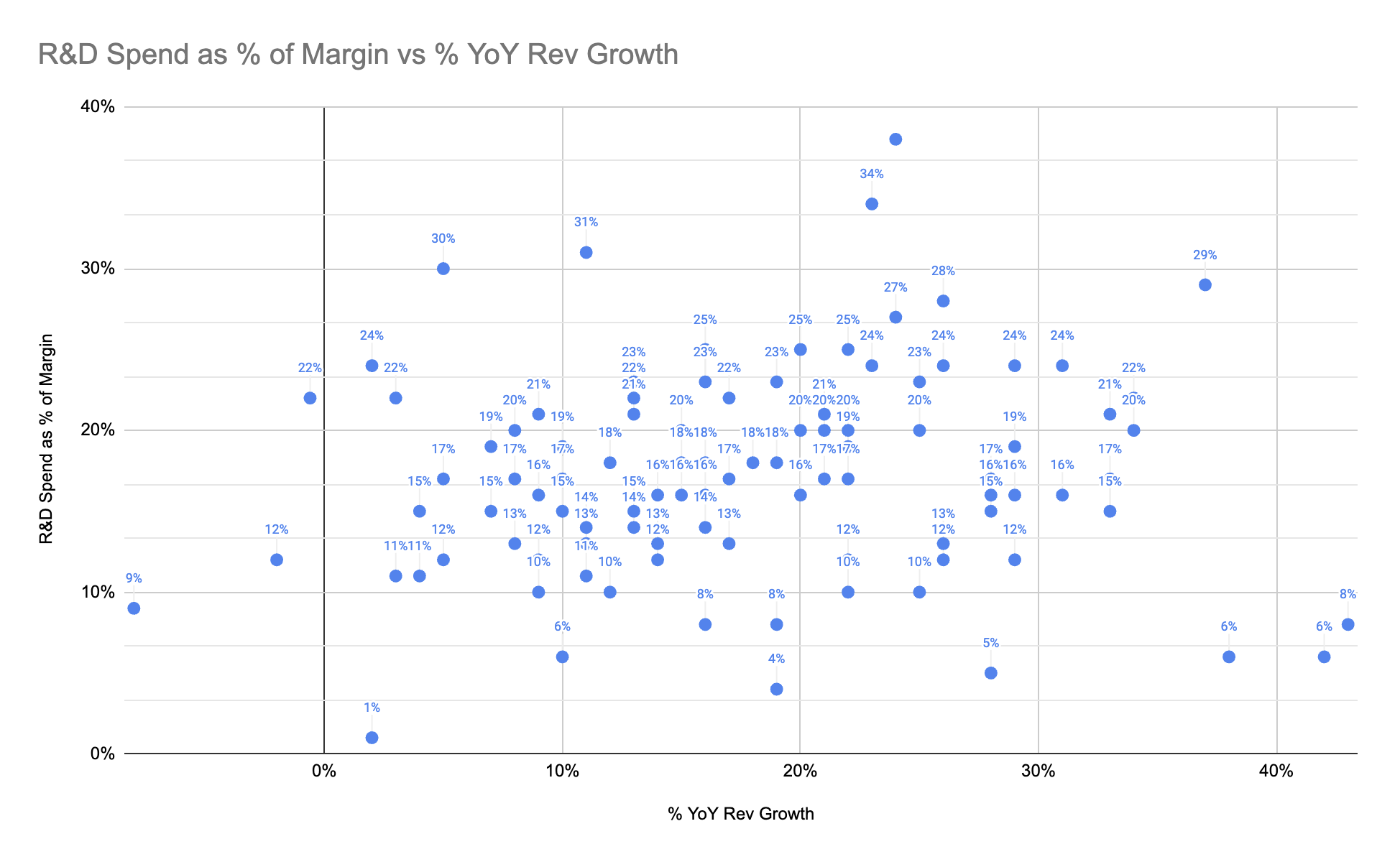
Over the past few years, one of the most useful charts I’ve found for explaining an R&D organization is a scatterplot of R&D spend as a % of margin versus YoY growth of last twelve months (LTM) revenue. Unlike so many other measures, this is an explicit measure of your R&D organization value as an investment relative to peer organizations.
Until recently, I assumed building this dataset required reading financial filings but my strategic finance partner at Carta, Tyler Braslow, pointed out that you can get all of this data for the tech section from Meritech Analytics, for free.
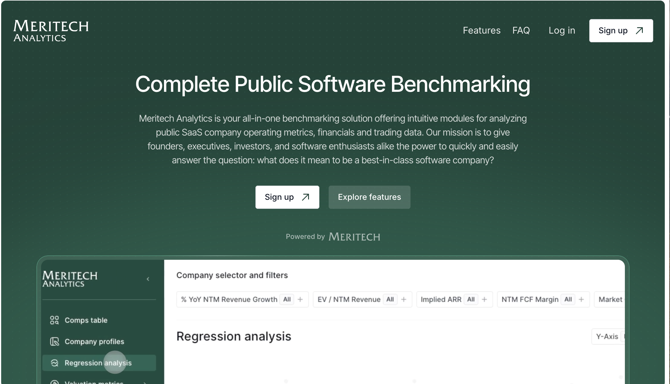
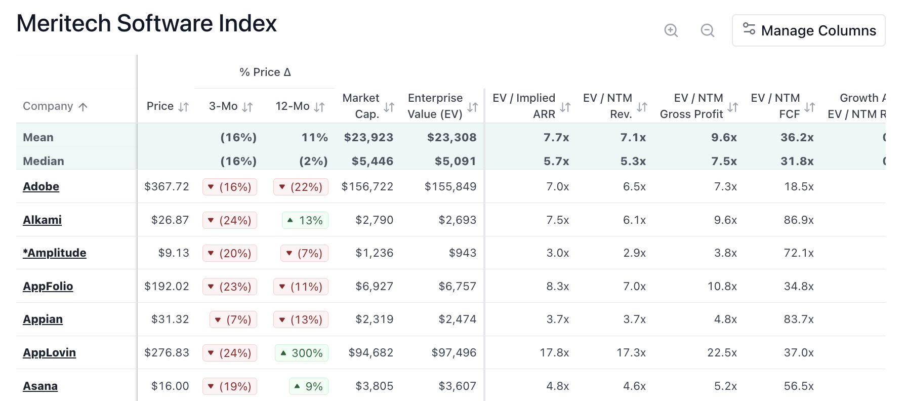
When you login to Meritech, you’re dropped into a table of public company comparables for tech companies. This is the exact dataset I’d been looking for to build this chart.
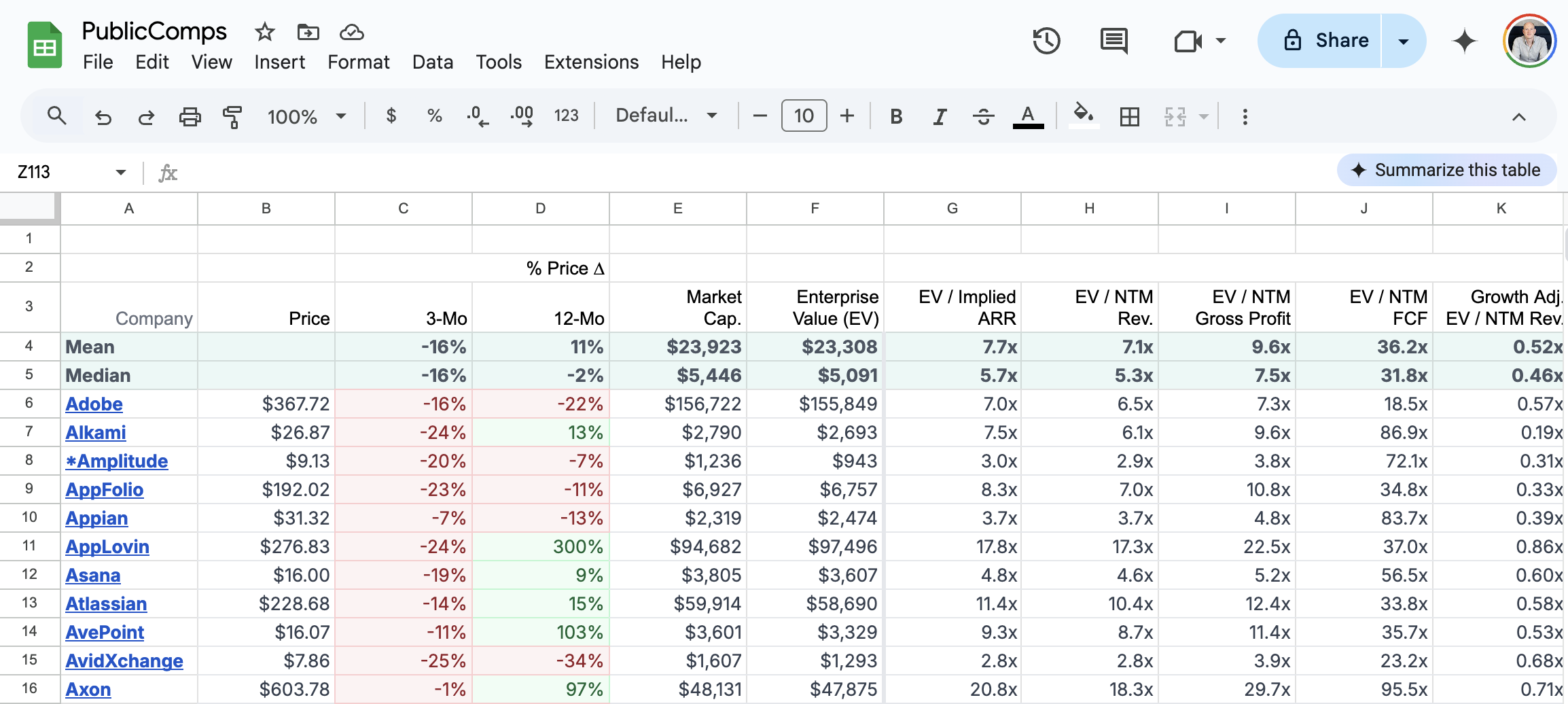
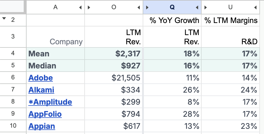
After logging in, you can then copy the contents of that table into a Google Sheets spreadsheet or Excel, or whatever you’re most comfortable with.
Within that sheet, the columns you care about are:
- % YoY Growth LTM Rev (column
Qfor me) – how much “last twelve months revenue” has grown year over year, as a percentage - % LTM Margins for R&D (column
Ufor me) – how much R&D spend is as a percentage of last twelve months margin - LTM Revenue (column
Ofor me) – although I don’t show this in the scatterplot, I find this one useful for debugging outlier values
Hiding the other columns gives you a much simpler table.
From that table, you’re then able to build the scatterplot. Note that being “higher” means your R&D spend as a percentage of LTM margin is higher, which is a bad thing. The best companies are to the bottom and to the right; the worst companies are to the top and to the left.

With this chart as a starting point, you can then plot your company in and show where you stand. You could also show how your company’s position in the chart has evolved over time: hopefully improving. Finally, you might want to cull some of these data points to better determine your public company comparables. The Meritech dataset has 106 entries, but you might prefer a more representative thirty entries.