Irrational Exuberance's Fourth Coming
It’s hard to believe (for me, I fully realize no one else cares), but it’s been almost exactly three years since I last redesigned this poor site. It’s gone from Blueprint CSS, to custom CSS with a reset stylesheet, and now on to Bootstrap. I have mixed feelings about moving to Bootstrap, simply because it’s become so remarkably widespread, but it certainly does make it quite easy to create a minimum layout.
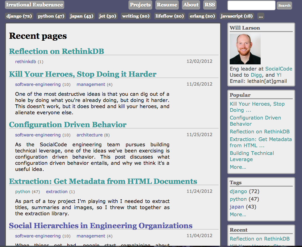
The third iteration was the culmination of five years of blogging, a bit over three hundred articles, and some ideas about content optimization influenced by working on Digg’s story detail page.
The frontend was rewritten to try to focus as much as possible on the content itself, and the backend was rewritten to be fast, collect usage analytics in real-time and suggest the best content based on collected analytics.

Honestly, I was really quite happy with how the third version turned out, and it received high praise indeed when @mtrier declared visiting the blog no longer blinded his eyes. There were just a bunch of small rendering issues that started to nag on me, and I wanted to try cleaning it up a bit.
The two central questions for me were:
- Can the writing–the whole point of having a blog in the first place–be give more emphasis?
- Can we eliminate any visual quirks which make it look like I’ve lost my mind?
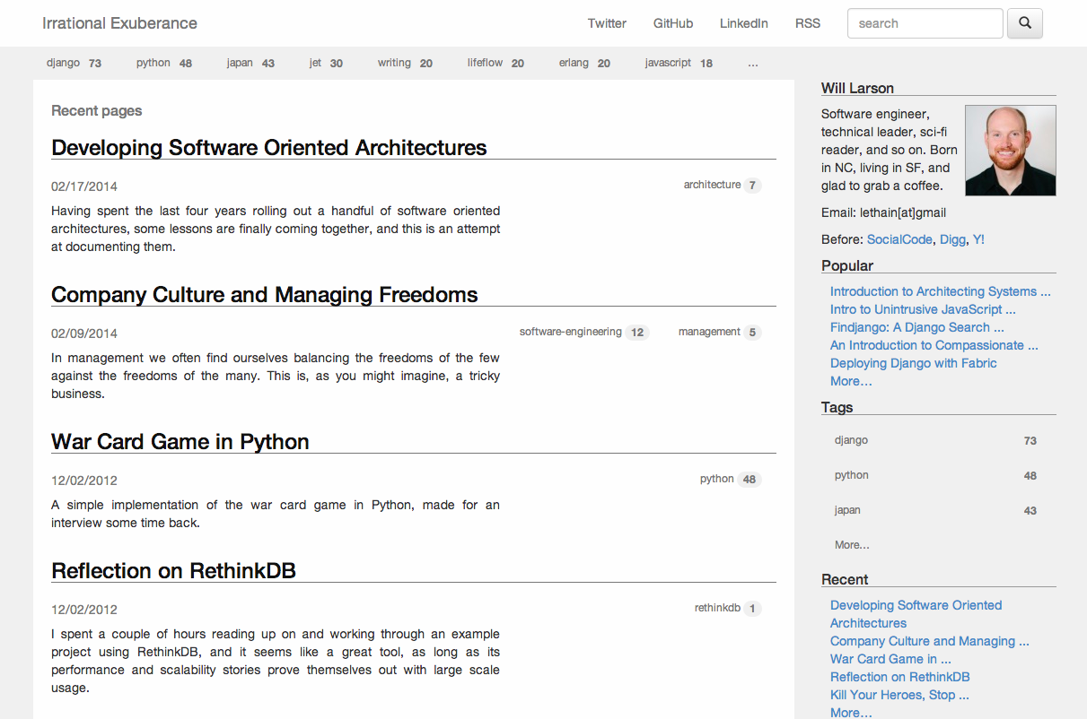
Here is the–clearly not far deviated from either the previous implementation or Bootstrap itself–update.

The improvements to my eyes are:
- Rationalized constrast: article titles have the most contrast, drawing the eyes to the content. Previously the header and tags had more contrast, despite being less important. The right rail is also relatively toned down.
- Responsive: rendering works coherently at most screen sizes now, in part thanks to @segdeha pointing out just how poorly it was rendering.
- Reduced color palette: there was a certain warmth to the previous colors, but they were also somewhat polarizing. No more.
- Moved from listing “Projects” and “Resume” to “Github” and “LinkedIn”, plus added “Twitter”. Also removed the “About” page, which was pretty misguided from the very beginning.
I have also redirected willarson.com to lethain.com for self-evident reasons.

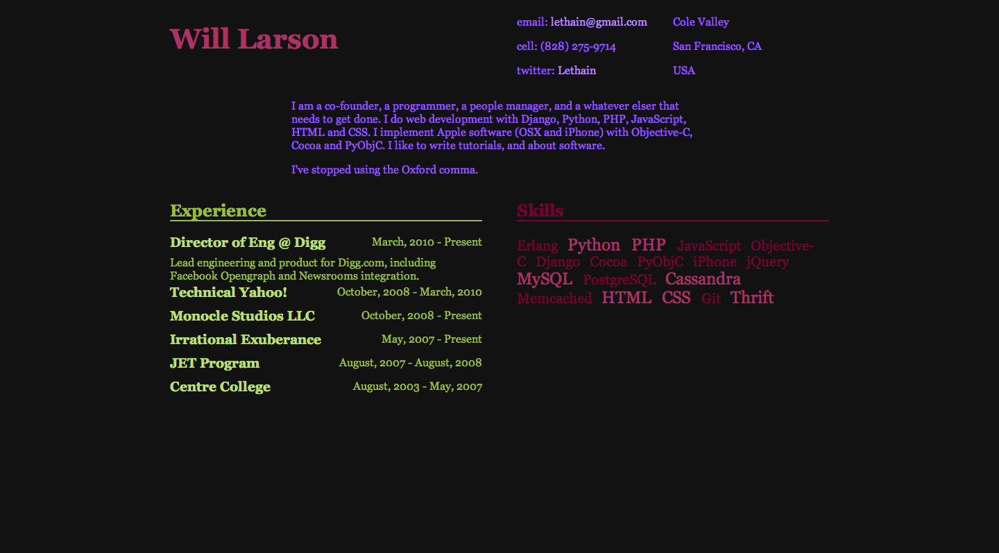
What can I say about those colors? I was young and optimistic. I also hadn’t updated that page’s contents in about three years, which didn’t do a lot to suggest I was likely to maintain it going forward either.
These changes, taken together with cleaning up my internet presences (switching to new headshots I had taken a few months ago, updating profiles, merging some lingering pull requests, etc) and I’m starting to feel like a brand new me.