Irrational Exuberance's Third Rebirth
Before I get discuss the newest iteration of Irrational Exuberance, let me start by asking, nay, begging, for any suggestions! Ok, with that out of the way. What has just happened here? Did I really just replace my custom blog implementation with another custom blog implementation?
Yup. And I’m calling it Sisyphus… for self emplanatory reasons.
Why???
Two reasons: first, my old blog was such a bloated and horrifying disaster of engineering that I simply couldn’t bear extending it any further (it needed to be extended to deal with an influx of comment spam, which got sufficiently bad that I ended up just turning off comments… which took three tries to do successfully); second, I’ve been collecting some interesting ideas from my last three years of professional development and wanted a testbed for experimenting with them. (Not all of those ideas are present in Irrational Exuberance 3.0, but some of them are. After investing close to a week’s free-time into the new version, I decided I needed to actually launch the damn thing instead of getting too greedy in the first version.)
Discussing the catastrophy that is LifeFlow isn’t super exciting (and it’s like criticing the third season of The O.C., it writes itself), so instead I present an discussion on the ideas I am attempting to experiment with, will be attempting to experiment with, and why the blog has changed in the ways it has.
This rambling discussion will flit over:
[TOC]
(There isn’t enough room to discuss implementation notes, so I’ll need to get around to that in a separate post.)
Into the breach we go.
Design Changes from v2 & Other Arbitrary Decisions
The first version of Irrational Exuberance was a WordPress blog hosted on a shared host. The second version was a custom Django application which suffered every symptom it deserved as a second system. Hopefully this third version will last a bit longer (as opposed, to say, my last bike which only lasted six months before being crushed by a meter-maid car, which in turn crushed me with crippling shame).
In thinking through the new design I had two major influences: the old version, and Digg. For those who don’t work at Digg, the influence may not be obvious, but both the approach to right-rail modules as well as the concept of Popular content (discussed in more detail below) are entirely derivative.
Articles
The focus of a blog should always be on its content. That is one thing that I’ve felt V2 did very well, in part because of its single column design which gave the entire page over to content (except for the admittedly fat header and footer which turned the articles in a rather bizarre rainbow sandwich).
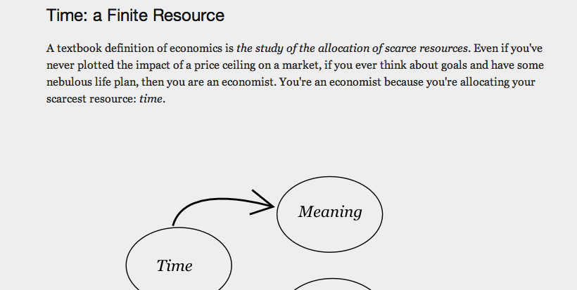
Here is a screenshot from the Money or Meaning: Spending Our Wealth of Time on the old site:
Here is the same section on the new site (the bottom border on the title in the screenshot looks really bizarre next to the border of the image in the post, but scroll up or down to get a better look at how they look in practice):
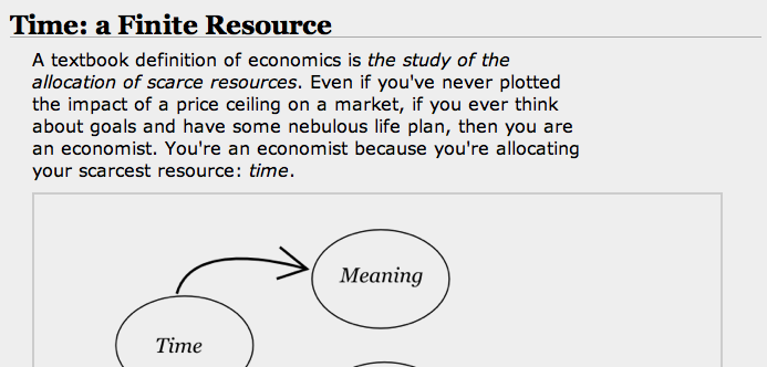
The paragraphs have been intentionally constrained to make reading easier (wow, it’s… challenging to find a reputable source which points to research on if or why the width of paragraphs should be constrained to improve readability. Is this really the best I can find? *No, it isn’t. Thanks to @cduruk for pointing out this much more credible study), images have been bordered, and vertical padding has been reduced. The available width for the article has shrunk from 700px to 550px.
All in all, not that much changed in presentation.
Header
On the other hand, the header has evolved quite a bit. The V2 header was a bit tall, but despite that it did a good job of creating a visual hierarchy of the navigation elements.
I’ll also miss the uniqueness of it. I don’t think anyone ever mistook Irrational Exuberance for another blog.

The new header tries to be as compact as possible while splitting navigation duties with the right-rail modules, and to allow readers to get immediately on to doing what they came to do: read the damn article.

Search is a major addition, and I’m curious to see if it gets any usage. In theory, search is the universal navigation element which can overcome any other navigation flaws, and it also scales up to solving users’ unique navigation quests (which articles did I mention Asheville in? what about Twitter?).
Visual uniqueness has gone away, but the new header is much simpler and brings search. That’s probably a win.
Footer and Modules
The V2 footer tried to do a lot and tried to do it with articles whose titles are usually quite long, which is an akward constraint. (That constraint still exists, but visually is handled a bit better in modules than in the full-width footer. That said, could have added modules into the footer–which is a pretty standard blog footer thing to do–which would have made the fat footer much easier to visually parse.)
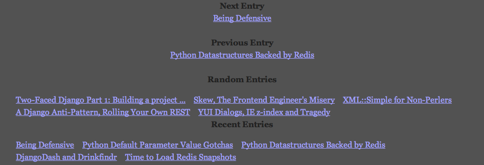
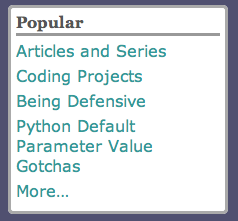
V3 does away with the thick footer and moves all of its content into right-rail modules. The modules scale out well, with even the shortest article visually accomodating five-plus modules.
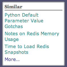
The hope is that the right-rail modules will make navigation easier (you are presented with navigation options immediately on reaching the page, rather than needing to scroll to the very bottom to discover content), as well as provide a platform for future experimentation.
Social Sharing
The previous version supported sharing to various news communities and social networks, but went about it using text links:

The new version is experimenting with using Digg, Twitter and Facebook share buttons which include the number of Diggs, tweets and shares.

I’m curious to see how this works out. In theory, including the counts directly in the button should probably discourage the first shares (people often prefer to associate themselves with something already successful), but for technical content like tutorials it’s probably not much of an issue. Either the tutorial is relevant or it isnt, and either your friends are interested or they aren’t: whether you are first or last may be irrelevant.
Well, the data will decide that better than my internal monologue. Let’s wait and see.
Modules
Most of the modules are pretty straightforward. The Recent module shows the latest entries, the Previous and Next modules show preceeding and following articles respectively. The Tags module (currently, only visible on storylists pages) lists the most popular tags (I removed top-level tag navigation, as it appears that almost ever actually uses tags, but I’ll need to do some log analysis for V2 to figure out just how true that statement is).
The Popular and Similar modules are slightly novel, and merit their own discussion in the next post which will discuss implementation details of Sisyphus.
URL Structure and Backwards Compatability
The old URL structure for articles included the year, month and day it was published in addition to a slug.
/entry/2009/oct/11/money-or-meaning-spending-our-wealth-of-time/
This kind-of-sort-of made sense if you believed you’d ever had a slug conflict, but for a one person blog that’s pretty unrealistics, and I hated that they had become so machine-friendly and human-inhumane. The new ones are simpler:
/money-or-meaning-spending-our-wealth-of-time/
I’m much happier with these. (I’ve updated all the old URLs to 302 to the new ones so that the old links still work. It’s a pretty simple rewrite, just strip out everything except the slug.)
Most of the other URL structures have remained the same, and any which have changed have rewrites in Nginx to ensure unexpected 404s don’t start cropping up.
Again, I’d love to hear any feedback, suggestions or complaints about improving this latest iteration of Irrational Exuberance. With that, I suppose it’s time for me to get back to writing about something more interesting after such a long break!