Introducing Kappa, a Twitter Client
(For people who are not interested in receiving content related to software I have written, please try subscribing to the Code RSS feed, which will continue to only contain tutorials and other general programming content.)
Today it is my pleasure to announce the alpha version of Kappa, a Twitter client for people with an unhealthy fascination with data and design. The word Kappa is the name of a Japanese spirit which lives in rivers and lakes. Although mischevious, they are an intensely respectful beast, and if you bow to one, then it will return the bow. While bowing, water--the source of their power--will pour from their head, and a traveller may safely continue along their way.
You might imagine there is a connection between that story and the name, but there isn't. However, to assuage that broken trust, lets take a look at Kappa's features.
Kappa's Fascinating Functionality
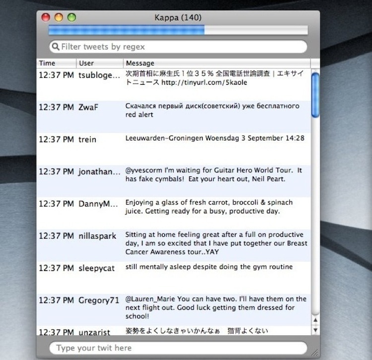
At the top of Kappa's window is a progress bar, which measures the time between the last update and the next one. Never again get antsy wondering when your Twitter client last updated.
On the other hand, if you really want to update right now, just click on the progress indicator and Kappa will update its tweets.
Equally central is the search field at top, which allows you to search all locally stored tweets using regular expressions. For example,
.*@searches for all messages with an at symbol, and.*abasearches for tweets containing the stringaba. The filter searches both usernames and the tweet's themselves, and the text in the search field will turn red when the currently entered text is an invalid regular expression.

All retrieved tweets are stored locally. This means you can review and search for old tweets from the comfort of Kappa even if you don't have an internet connection.
Speaking of retrieved tweets, using the
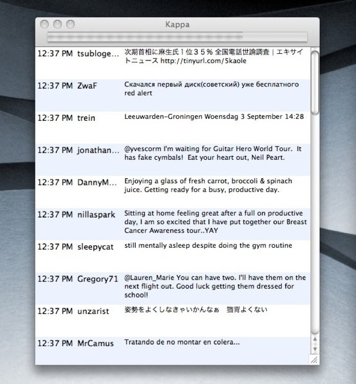
Feedsmenu, you can mix and match retrieving the standard timeline (called theFriends Timeline), the public timeline, and also replies send to your name (@lethain Kappa keeps crashing, why?, for example) --whether or not they are already your friend on Twitter.Kappa tries to maximize its available space, so when Kappa's window isn't in front, then it will hide the filter field, the tweet field, and even the columns on the table. This frees up more room to see tweets. It'll still display the progress bar, though, so you don't have to worry about when you'll get your next hit of social babble.

- Kappa allows you to sort columns by time, username, and message content. Although seemingly useless, this functionality combines well with the filter to perform interesting and complex queries.
Download Kappa
Kappa will only run on OS X 10.5 (Leopard). For everyone on different platforms or with older versions of OS X: sorry!
I hope you download Kappa and give it a try. I'll stress that I began programming Kappa yesterday, so it will almost certainly have some bugs and issues. If you have any errors, issues, or ideas, then please send me at mail at lethain@gmail.com.
What Kappa Is Not (Yet)
When you first open Kappa, you might notice that Kappa fails to meet you minimum expectations in some crucial way. There are three possible reasons for this.
- I have actively decided against the idea ("I don't like that.").
- I have passively decided against the idea ("I won't do that yet.").
- I haven't thought of the idea ("...say what?").
So far, most ideas you might want fall into category #2, including:
Using a custom view instead of a tableview to display tweets. This ends up catching a number of related complaints: its hard to see full tweet text with a small width, its hard to see full username with small width, it doesn't display a user's profile image, it doesn't display a user's location.
These all relate to thus far not choosing to use a custom view. There are a handful of counterarguments: the tableview allows sorting (helpful for a data lover's Twitter client), the tableview allows reordering (customize to your liking), and--perhaps most important--the tableview is already implemented.
My current thought is to eventually add additional columns for all desirable content (namely location and images), and to allow users to customize visible columns within the preferences panel.
The filter field is frustratingly placed, because it is the first thing you notice when starting the application, and your first urge is to type your tweet into the filter field. However, I don't feel there is a clearly better location for it either.
A possible solution is to allow users to choose whether or not they want the filter to be displayed. I'll keep reconsidering this as work on Kappa continues.
Well, thats all I can think of at the moment, but there are undoubtedly other issues to be ironed out. Give Kappa a download and shower me in as much feedback as you feel like generating.