Designing Elesma
For the past week I have been working on a new app, which is operating under the tenative name of Elesma. The initial concept of Elesma was a personal assistant: a program to help do routine tasks, to free you to stay focused on your current project.
I won't go on for too long, but I wanted to take a look at the UI I am prototyping at the moment, which has a handful of fun ideas going on.
Suggestion
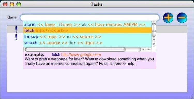
One of the most helpful things a textfield can provide is suggested completions to what you have typed so far. This gets even more helpful when you are typing something with a specific syntax you need to match. Cocoa has some built-in support for this, but after working at it for a bit it seemed like I was going to need to roll my own.

This is the current revision of my handrolled suggestion completion. I think even looking at it for a second you realize that it would benefit greatly from being slightly translucent, and thats definitely going to happen as it matures. Also, the example and description area at the bottom looks somewhat tacky, but is nonetheless quite helpful for teaching how everything works. It will definitely be reworked into something more appealing (and more useful), but I think that properly implemented it will be helpful.
Looking at the suggestions, you notice that they are all colored, lets talk about that.
Syntaxes and Color
I think that color is definitely underused as a means of cleanly conveying large quantities of information. Here blue indicates the command you are issuing, orange represents parameters, and dark grey represents contextual keywords for multiple parameters.
However, it would be a real pain if everytime you used "at", "in" or "for" it was assumed to be a contextual keyword. Instead, you really want each command to have the ability to decide what its own keywords are, and that is what is happening here. The suggestions in the suggestions box are not hand-colored examples, but are instead being colored by the syntaxes themselves.
For example the alarm syntax: a query that starts with "alarm" and has two parameters separated by "at". With that knowledge the syntax knows enough to color a plain uncolorred example string it has stored (it also stores the description string that is currently displayed under the example, and some other stuff).
So, I think its pretty nifty to have each command determine its own syntax, and is a nice step towards making a command language that is more human language oriented. Another neat bit...

(Yuck the size of the suggestion bar should never be larger than the number of suggestions, something else that will have to be cleaned up.)
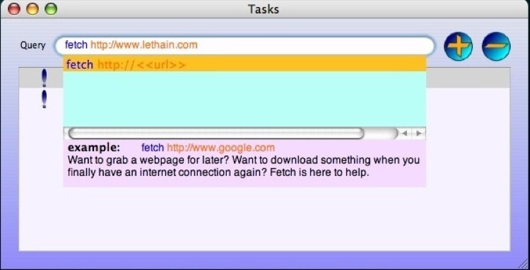
Anyway, when you type into the text field it immediately colors the text you are typing, just like a code editing tool would, including correctly coloring the arbitrary keywords a syntax can declare for itself. I find the visual feedback is really reassuring. You know when you've correctly entered a command phrase because the text you are type will shift from blue to orange. You also know you've used the right contextual keyword because it will shift to gray when you type it. Nifty.
Overall Look
Now just some thoughts on the overall look of the application.
![]()
First, a disclaimer, that the current buttons are just something I had hanging around from a previous project, and they'll be updated to more self-evident icons. Or they might be thrown out completely, their fate is still in the air.
Next, its definitely blue. Lots of blue gradients going on there. Blue gradients in the buttons, a blue gradient background. I once foolishly tried using brushed metal for something I built and the outcry was immediate against such a criminal decision. Still, I feel like the plain-Jane dull-gray-is-so-hip-these-days look of default UI components is a bit bland, so I was trying to make it a little bit more visually interesting without going overboard on it. I don't know exactly where the overall visual design will end up, but neither want it to blend in with the standard Apple stuff, nor to stand out from it. Admittedly, thats a thin line to walk, and will have to be walked mostly in the fine details rather than in sweeping strokes... but I think the gradient background of relatively subtle colors fits into that philosophy.
The status icons (the first column in the table) are pretty simple, and I'd be a liar if I said I spent more than fifteen minutes making the batch of them (the "waiting" status icon is not shown).
Tasks AKA Doing Stuff
Elesma essentially has three non-trivial aspects as far as programming goes: syntaxes, tasks, and results. I have already spoken a little bit about the syntaxes, and I haven't put a whole lot of thought into dealing with results yet, but I have put together the broad framework for tasks.
In uselessly broad terms, a task is Elesma doing something. There is an abstract Task class, and it gets subclassed into various groups of tasks. Lets think about what an Internet Task might encompass.
First, one of the most important considerations for Elesma is I want it (her?) to be extremely helpful for people (like me) who are not always connected to the internet. So, internet tasks have to be (and are, although the SystemConfiguration framework and its bitmasks will never be a friend of mine) smart enough to wait until an internet connection is available. The simplest example of this is 'Fetch', which wants to simply download a copy of a URL to disk. More advanced ideas might be to search Google and fetch the top ten requests, or to grab a wikipedia entry for later perusal offline.
In that vein, you might consider Elesma to be a very helpful todo list that will check off tasks on its own to the best of its ability, and let you know what still needs to get done.