Defining Your Web Aesthetic
I am in the early stages of designing a website for a friend, and I wanted to get some feedback on his asthetic preferences for websites. I started by sitting down and drawing a storyboard with a handful of different designs and features, but decided that I needed a more useful way to find his broader ideas about design and layout.
For this purpose I have devised a little test, at the moment consisting of eight questions, but likely to change considerably as it evolves from eight marker & colored pencil drawings into something more considered.
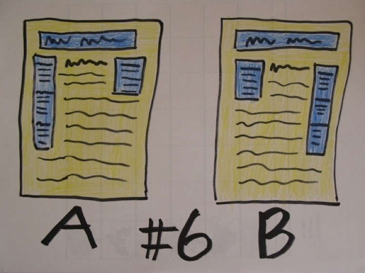
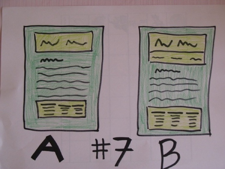
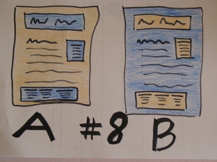
Taking the test is very easy: simply write down if you prefer A or B from in each of the pictures. I hesitate to call it profound, but it did force me to reconsider some of my recent layout decisions.
Question One

Question Two
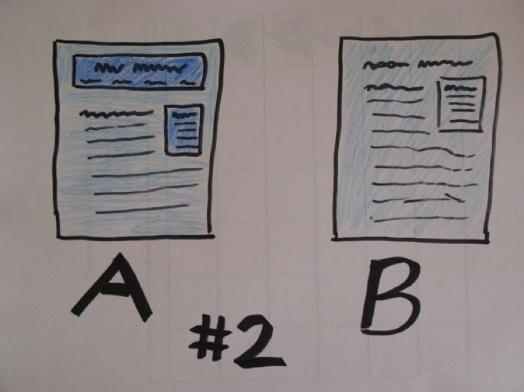
Question Three
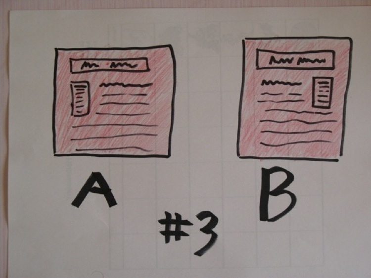
Question Four
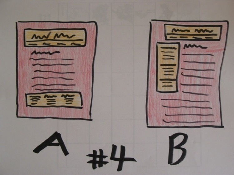
Question Five
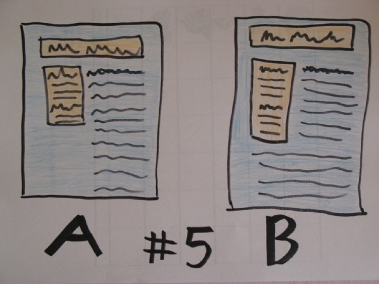
Question Six
Question Seven
Question Eight
The Results
This isn't a test designed to magically read your personaity based on your webpage preferences, and there really isn't an automated response or evaluation mechanism I can give you. Its really designed to be useful for a designer trying to understand the aesthetic of the individual they are designing for. It is incomplete, and most noticably doesn't address color preference.
For the record, my answers are ABBBBAAB. Anyone disagree?